Transported review: visit the house of rich people in VR
Transported is a nice app on Oculus store that lets you take tours of awesome houses from all over the world. This has two purposes:
- If you’re rich, you can take a tour of the house from wherever you are in the world and then decide if buying it.
- If you’re poor, you can see how is it living in a big house and then cry in a corner. I belong to this group, of course.
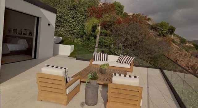
Obviously the target of this app is the first category of people: buying a house is a very complicated process and you have to visit lots of houses to decide which one is the best one and this makes you lose a lot of time. I’ve friends that have just gone through all this process (not for millions-worth houses, unluckily) and this is just a nuisance. So, why don’t make all this better doing the tours in virtual reality? This is surely the idea that got the guys of Transported… an idea that is surely interesting. I’m sure that no virtual tour can substitute at the moment the action of going inside a house and feel how it is from the inside, but virtually one could go even to 100 houses in few time and then going actually in real life only to the 2-3 ones that seemed the most interesting.
Transported is currently in preview, so it lets you visit just one house in Los Angeles. When you start it, you enter inside the first 360 photo, where you are just outside the house door. if it is the first time you try a tour, some coloured popups will tell you what to do, guiding you through all the process. Even if the pop-up colours are a bit too strong and if its window have some issues with orientation of the head, I appreciated a lot the intro tutorial.
Interaction with everything is made through gaze and Oculus Remote clicking: in every 360photo you are, there are some points of interest:
- Blue points of interest makes you appreciate little details of the house: for example they tell you the material of the floor, if it is particularly elegant.
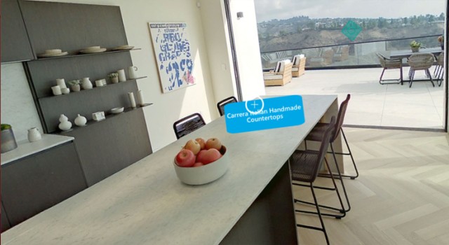
- Aqua points of interest are for navigation: they make you move from one room of the house to another. You have to look at it and then click with the remote to teleport to the other room.
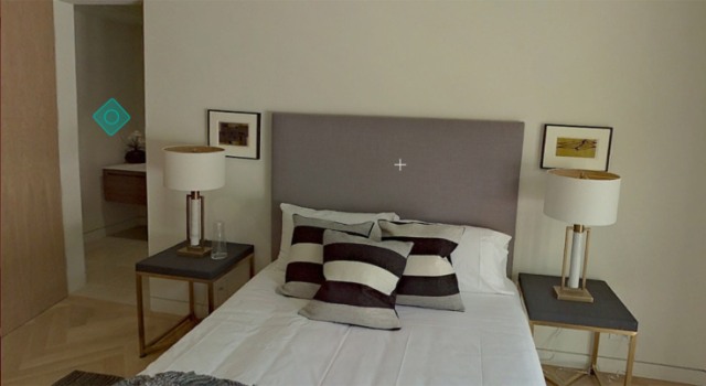
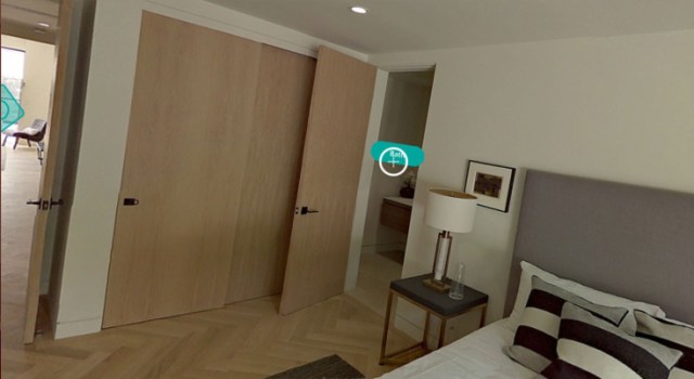
Apart from this navigation mechanic, the user has also the ability to click on the Remote click button to open up a menu that:
- Shows the house sale details (price, owner, etc…)
- Lists all the house rooms
- Makes the user jump to any room of the house, indipendently from the user’s current position
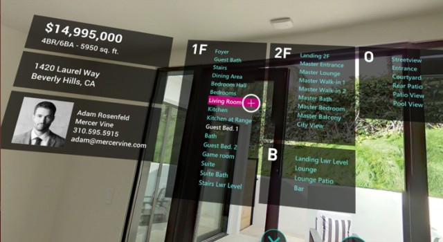
This shortcut menu is very handy, since it makes navigation very fast and let the user see only the rooms he’s mainly interested to (e.g. the bedroom and the kitchen), without searching them.
So, the tour consists in experiencing lots of 360-photos of the house, good enough to have a first impression of all the rooms. Moving from photo to photo, you take a tour of the beautiful house. When you see an outside-photo (e.g. a balcony), there are also some nice environment sounds that add a touch of realism.
What I didn’t like of the photos is that they are 360-degrees-only: I mean, there’s no sense of depth. I know that taking 360-3D photos is far more expensive, but results are more amazing. These photos have something unreal inside them, you clearly see that they’re not true… you really miss the sense of depth. I think that with 360-3D photos and more ambient sounds for each room, the tour would be far more immersive and engaging. On some scenes, like outside ones, it could be cool to use 360-videos, so the scene appears more real (because you see the trees bending with the wind, the cars moving… and you feel you’re really there).
In the end I liked this small experience. I liked the idea, because it makes people like me dreaming of living in a big house and it makes rich people buy a new house in a very effective way. I repeat that in my opinion this can’t substitute a real tour of the house (I didn’t sense an emotional bond with the house while I was there… I appreciated the Look, but didn’t get the Feel), but can help a lot in making a decision about buying a new one.
The app has some fixes to be done (Oculus Touch support didn’t work for me, some tutorial window have orientation that should be fixed, etc…) but is surely appreciable. If they continue developing it and improving it with some features I suggested… it has a great potential. I liked it. If you want to try it by yourself, you can find it on Oculus Store.
Disclaimer: this blog contains advertisement and affiliate links to sustain itself. If you click on an affiliate link, I'll be very happy because I'll earn a small commission on your purchase. You can find my boring full disclosure here.


