Hands-On Quest Menu Direct Touch Interactions
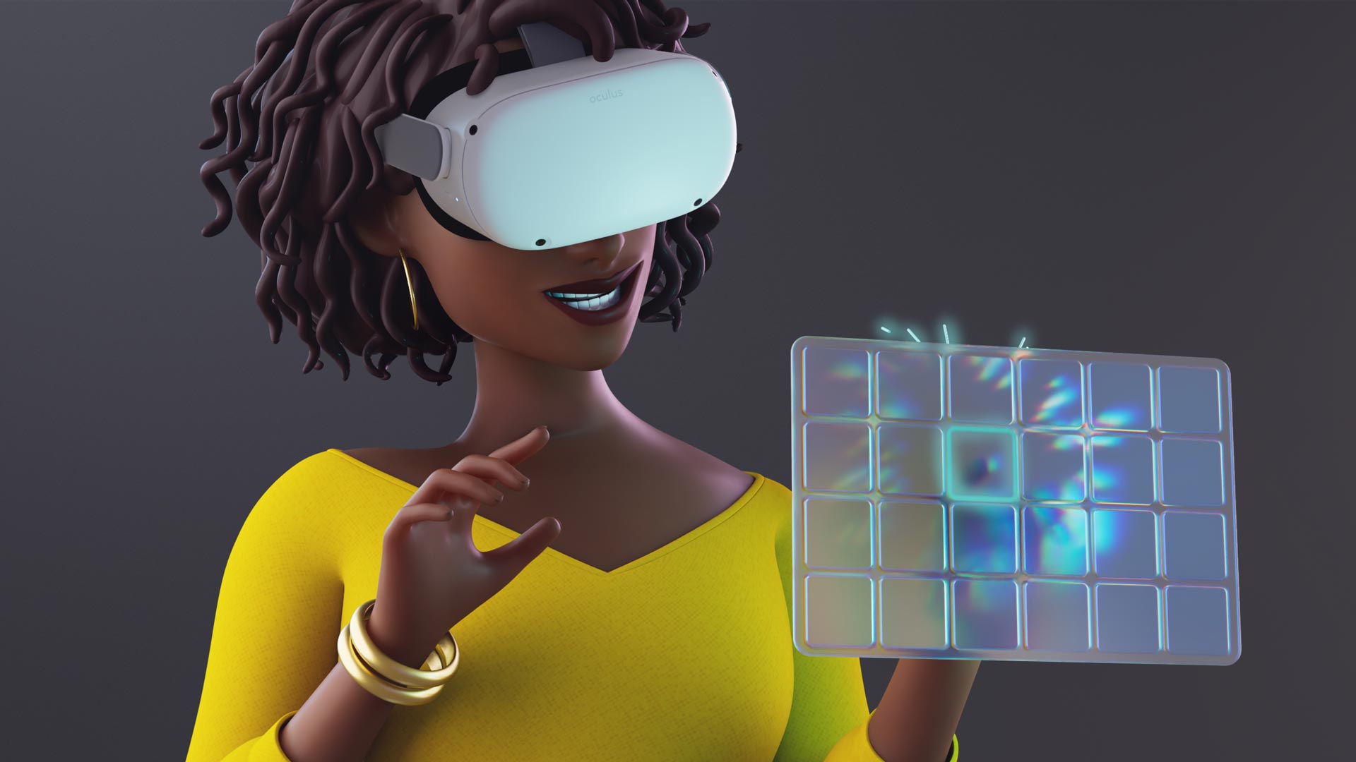
Quest runtime v50 has brought with it an interesting innovation: the ability to interact with the main menu by directly touching it with your fingers as if it were a tablet. But is it as cool as it seems from the videos? Read my review and you will discover it!
Direct touch interactions
Before Meta Quest runtime v50, the only way of working with the Quest main menu was via ray-casting: you used the controllers (or the bare hands) to cast a ray towards a menu item and then you pulled the trigger (or performed the air-tap) to activate that item. While this method of interacting is very effective, it is not very natural: in real life, we don’t point and click on items.
The runtime v50 introduced the possibility of directly interacting with the main menus by touching them with the fingers as if the menu was a tablet. You can poke buttons with your fingertip to activate them, and you can swipe your index fingertip on the menu canvas to scroll it. When the first videos about this new system popped up on social media, everyone was amazed. Interacting with Quest had never been so natural.
It seems the perfect way of interacting with the Quest, isn’t it?
How to activate Direct Touch Interactions
I decided to go hands-on with this system to test if it was actually cool also to use and not only to see. The first thing I had to do was to activate Direct Touch because it is an experimental feature and it is not available by default.
To activate Direct Touch you must:
- Open the settings of your Quest (you can go there by going into the Quick Settings and then clicking on the Settings button, for instance)
- Select the “Experimental” category
- Flick the switch relative to “Direct Touch”, which is disabled by default.
When you activate Direct Touch, two things happen:
- The menu canvas becomes smaller
- A tutorial starts to show you how to work with this different kind of interactions.
I appreciated the choice of showing the tutorial, because while the interface is very natural, it is still a new interaction scheme, so it is good to guide the user during the initial stages. The tutorial is also very well made.
Hands-on Direct Touch interactions
After the tutorial, I started using the system, and I immediately started having mixed feelings about it.
Let’s start with the good sides of it: it is very cool. Scrolling the screen by just swiping the finger on the rectangle of the menu, as if it was a tablet, is incredibly intuitive and also oddly satisfying. And pressing the buttons by just touching them with the fingertips is so natural. As soon as I started using this system, I wondered how I could live before without it.
BUT I also started to feel more strain. Interactions with the controllers are not natural, but they are very easy to be performed: the arm is closer to the chest, and the hand should rotate a little to point to the desired element, just enough to make the pointer reach the right spot. It’s quite comfortable.

When you have to use your fingers on a world canvas, though, your hand should go up and in front of you, meaning that the arm must be floating in the air, with his muscles sustaining it. Since it is not close to the body anymore, the muscles are doing more fatigue to keep the arm in that position, meaning that using this control scheme is actually quite tiresome. Just to make a comparison with the tablet, to make you understand it better: usually, we employ a phone/tablet by keeping our arms down, putting the device close to the chest and just moving our hands the necessary to interact with the screen. But imagine if a tablet were attached to the wall, at 40cm in front of your head: for sure you are not comfortable using it in that position.

In the beginning, I was having even more strain than needed because I was keeping only the index finger open while closing all the other fingers in a fist. But then I realized that Meta people have been smart and so made only the index fingertip interactive. This means you can even work on the system with the whole hand open because the other fingers are not cluttering the interaction. This way, it is much more comfortable to use.
So, interactions with controllers are much more comfortable than Direct Touch ones. But also if we consider hand tracking, the traditional point-and-click and point-and-swipe with bare hands is less tiresome, because, again, you can keep your arm closer to your chest. Swiping with raycast just requires small wrist movements, while direct touch requires larger hands movement to physically move the canvas. It is like you needed to actually move the canvas with your real hand.
Another big problem that I’ve found was in the performances: this system seems to be pretty heavy, that’s why it is experimental. I had the impression the interactions were slightly slower than before, and I had confirmation when I started the screen recording. The first time I did that, the framerate of the Quest dropped like it never happened to me during screen recording, going to something like 40fps, and the system started stuttering a lot. The other times I did it, I never had this big frame drop again, but still, I could see the system not being able to keep a consistent full frame rate. Even without screen recording, I had some occasional stuttering. I guess still a lot of optimizations are needed, and this may explain why the feature is still flagged as experimental.
A few other details may be interesting to add. As I’ve said, when you select Direct Touch, the menu canvas becomes smaller, I guess because this way you can more easily reach all of it without moving your hand too much. But being so small makes it also less readable. The interesting thing is that you can still make the screen bigger and curved and interact with it using raycasting as you did before.
Touch interactions work both with bare-hand tracking and controllers, but when you use them with controllers, they feel a bit weird. Hand tracking is where they truly shine.
Talking about bare hands, they make the interaction more natural, but they lack true haptic feedback. When I use point-and-click, I have the feedback from the trigger of the controllers I’m pulling, which helps a lot in understanding that I’ve selected that interaction. With my hands, I don’t have this luxury.
The good thing is that Meta with Direct Touch implemented some smart UX tricks to give at least a sense of “phantom touch” with bare hands. The virtual hand never goes beyond the canvas of the menu, as if the physical object of the menu prevented it from going further. And when the fingertip touches the canvas, there is a subtle “tap” sound emitted by the system. The combination of the audio cue and the visual cue of the hand not trespassing the menu creates a sense of phantom touch which helps a lot with the realism of the interaction.
The keyboard
If I had to choose one thing that I’ve found much better with Direct Touch interactions, that thing is the keyboard. I touch type on my computer, and no virtual keyboard has ever been able to give me the same typing speed I have on a physical one. BUT with the Oculus keyboard powered by Direct Interactions, for the first time, I could use a keyboard in a comfortable way with two bare hands. I still found it very clunky, and I still made many errors while writing on it, but actually, I managed to coordinate my two hands quite well: it was to me like a dive in the past, when I was a teenager and I typed on my computer using the two indices of the hands. Thanks to the phantom touch sensations and the dexterity of my indices, actually I’ve found typing in VR with both hands for the first time “not terrible” which is already a good thing.
Final opinion
Direct Touch interactions are the classical example of a user interface that is amazing on video but then shows its problems when you use it in reality. I always stress that VR interactions should be tried in VR and for a good reason: only by using them, you actually notice the problems.
I love that Direct Touch offers an interactivity that is natural, intuitive, and cool to use. It even showed me that typing in VR could become possible one day. But it is also more tiresome, and performance-heavy. That’s why I disabled it for now on my Quest 2.
I like that Meta is experimenting with new interaction schemes, and that is striving to obtain a natural feel. I think that now is necessary that Meta improves it until it is as comfortable to be used as the other methods.
(Header image by Meta)
Disclaimer: this blog contains advertisement and affiliate links to sustain itself. If you click on an affiliate link, I'll be very happy because I'll earn a small commission on your purchase. You can find my boring full disclosure here.


